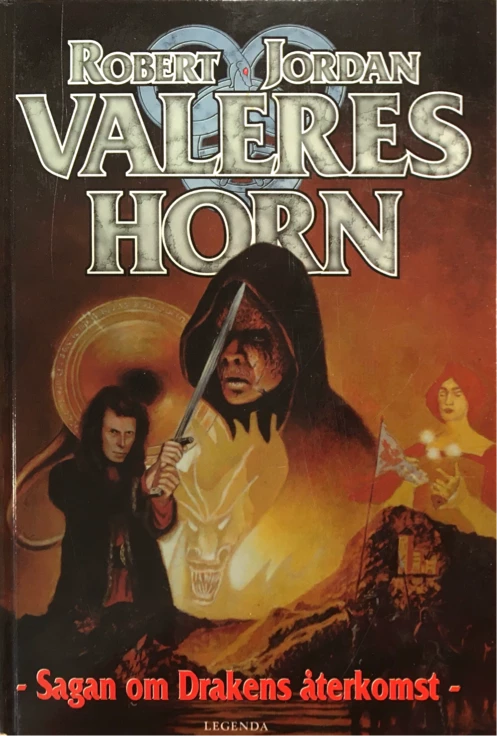
Think of how the first scene of a book unfolds in the mind. Like a high-speed film of a painting blooming layer by layer, one visual detail after another fills the open canvas. Except of course, the first image is the cover and all other materials that might wrap and precede the actual text: back cover, maps, title page, chapter heading. So almost no one enters a true “white room” when they begin reading chapter one or the prologue. We expect the first page will relate to those preceding and surrounding materials.
Yet details aren’t seen until they’re described, and reading is a generally linear process. We have to constantly backfill things that were always “there.” In two sentences we might first meet a lord and his distinguished guest standing under an ashfall, surrounded by servants. Until made explicit, the remainder must be sketched in from implication. They’re apparently outside somewhere, a desolate place. They would likely be dressed according to their high station in this society, and the parasol might suggest something like suit and vest, but we can’t be sure before that detail is given. Servants who “scuttle” are not likely to be respected by these characters.
Details continue to fill in. For example, this guest has complex tattoos lacing around his eyes, but we don’t learn that until the fifth paragraph. We don’t imagine the tattoos appeared at that moment in the scene; they were always “there,” so we revise our memory to include them from the beginning. We automatically smooth out the discontinuities which are inherent to the act of reading, so long as the author has provided a reasonable sequence of information and hinted at scene elements as much as possible, as early as possible.
So begins Mistborn: The Final Empire by Brandon Sanderson.
Notes on first pages
What strikes me now is how much the environment is the dominant character here. The simple but memorable opening line belongs to the environment: Ash fell from the sky. Environment-as-character is a concept perhaps more familiar in literary literature, although the tradition extends from the roots to the peaks of SFF: take for example Arrakis or the motherland, Middle Earth. It would be only fair to say that Setting is integral to the existence of SFF as a category. We just don’t often construe the setting as a character (maybe in part because Character is a weaker, less-valued aspect in the cross section of SFF). From the outset, we meet an ash-filled sky interacting and developing relationships with the human characters.
One appealing element of Sanderson’s work as a whole is how much the worlds and landscapes are transformed over time. They’re not just a backdrop. They’re alive and active. That—the great promise of the Cosmere—is signaled from the very opening of Mistborn.
The book begins in motion. Besides the immediate movement of ash falling, there’s a bit of human action—servants scuttling forward to extend a parasol—and the scene is grounded in character—Lord Tresting frowns at the sky. Metaphorically speaking, the environment is a character with relationships to the human characters. From the deleted scenes I learned the first draft of Mistborn opened with a third-person omniscient overview of the world, like the wind sweeping through the Wheel of Time intros. That sort of point-of-view shift might be considered clumsy nowadays, but I don’t believe it must be.
Yet I think this alternative point of view, lord of a minor outlying plantation, provides a useful starting point for the book. Tresting is an insider to the Empire, loyal to it, contrary to any other point-of-view character until near the end of the book (nice symmetry). Tresting also makes a self-confident, unselfconscious counterpoint to the hero from the epigraph. Of course this self-assurance is the fragile confidence of a bully and slavemaster, but Tresting doesn’t seem to let himself confront his own weakness.
Notes on the cover
Epic fantasy covers tend towards painterly naturalism, with dramatic color and lighting.
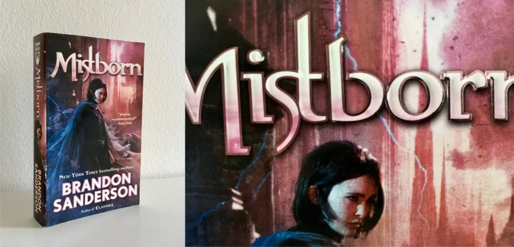
Have you seen covers from international editions of Mistborn? They’re worth perusing. I’m not going to discuss them, but you see a whole range there to compare with the one I’ll speak of, painted by Chris McGrath. I’m very attached to this book with this cover. They are one total package to me. Whatever flaws it may have, it is the face of the series for me. Several other covers are excellent, but this is classic.
The magenta and indigo, with black between, are a gorgeous combination. They evoke the light through a rose window as much as they suggest a dark and brutal world—wonder and harshness twined together.
Kredik Shaw is prominent in the background, bringing touches of dystopia to the atmosphere. It’s a perfect expression of the dark but vibrant atmosphere of this book. The world of the books is ash-stained, almost colorless save for the red sun and stained glass, but it’s not bland. Those spires behind Vin, combined with the pinkish haze, evoke a sort of alien world or futurism, as if there were science fiction bleeding into this series. That’s no false promise, even without considering the long arc of Mistborn yet to come. I wonder if Chris McGrath was clued into the future of the series when creating the illustrations. If he intended a sci-fi background here, or I’m just projecting what I want to see into it.
The art has marvelous texture. It’s like with a glance I can rub my thumb across the scene and feel the emotional roughness. I like this more than the creamy, glossy look of later versions like the 2019 reissues.
Yet I will admit these images seem just a bit under resolution. This is painfully evident on The Hero of Ages. Not sure what happened.
This lettering for the title is also an unusual blend of calligraphy and modernism. It has a machine-like quality, crisp with neat curves, but you can see how it mimics the handmade quality of old engravings. Whether hand or machine, you can picture metals being involved in producing these letters. How appropriate! I have somewhat more to say about this typeface, but I’ll save that for a sequel post. In short though, this title font alone has really helped distinguish Mistborn within the fantasy genre.
As I’ve spent more time with these covers lately (I just reread the trilogy), I have realized my favorite cover is definitely the first book. I just love the colors and composition. The mood is right. Vin looks intense and dangerous; her mistcloak is stunning.
The other two covers are good, but they don’t have the same depth or verve. On both covers the background and foreground feel disjointed, flattening the scene, and the color schemes are less dynamic. The Well of Ascension is the only cover to show action, which is cool. But it doesn’t quite fit the interior. I know covers don’t often depict a real moment from the book, but I still have to wonder: What’s that obelisk? Why is Vin fighting some random obligator? It was a question I had from the first time I read the book.
Only recently did I see the full painting (which is cropped for the mass market paperback) and, having seen it in full, I can rephrase. Why is Vin fighting an obligator in the sky? The obligator is flying. That man should be an Inquisitor, when he so clearly is not. Yet of course if he were, the cover still wouldn’t match this particular book, where Inquisitors are almost totally absent and never interact with Vin. I must imagine it was supposed to illustrate the skirmish near the end of book 3, the only canonical event from the series that almost fits. If so, either Elend was painted for book 2, or book 2 didn’t get its own cover. I suspect the latter. What a shame! Book 2 is full of iconic moments (Vin striking with a koloss sword, running rooftops with a wolfhound, sparring with a shady Mistborn, entering a pool of light) and includes some of the best character development in the trilogy.
To give the artist a fair chance to defend himself, he has spoken on this subject in at least one interview: “In the end you want to have an attractive package to make potential buyers stop and pick it up. That’s why a lot of the time there are a lot of liberties taken with the actual story. As long as the cover captures the mood and feeling of the book, the inaccuracies of the details are OK just as long as you don’t go too far off the mark.”

