Part one introduced Bo Berndal, the maker of this typeface. I riddled about sand pillars and lions. Besides the lack of resolution there, you may have noticed I also did not explain in full what exactly makes Palekin so unusual. Understanding the quiddity of its oddity will help you appreciate why I got so engrossed in the question of origin. In keeping with the tripartite tradition of Western storytelling, this is the part where I wander through the wilderness of middle.
From a traditional type design perspective, Palekin is downright weird—so I’ve had to imagine that’s the whole point. Call it anti-calligraphy. Not that Bo aimed for something ugly, but rather, I suspect, because he loved experimenting. He wanted each stroke to invert expectations. The result is unworldly. No wonder someone put it on the face of an epic fantasy.
Some of Bo’s most-seen fonts are far more reserved, used across Sweden in public contexts like road and transportation signage. He invested copious thought and energy over the years to maximize the legibility of fonts, for such difficult cases as reading newspaper small print on a shaking bus. These don’t call attention to themselves as such. They’re made to be clear and undistracting. Looking at these, you’d never imagine they shared origins with the likes of Palekin. I think too the ones Bo was potentially most proud of—those he named after himself or people he admired, the ones he mentioned often in books and interviews, as well as the assortment wallpapered across his online profile page—unlike Palekin, these favorite children had more obvious ancestry, obeyed tradition, respected their elders, would not be found splashed across an amateur rock band poster or some kind of pulp fantasy book. (While both cases might well have pleased Bo, neither group was his core audience.)
But as a fiction writer I extrapolate a more nuanced story. I imagine his fondness for Palekin. At worst it represents a guilty pleasure, nothing he would tout among high-minded colleagues, not the finest example he would encourage students to emulate, but still a creation worth giving the world. At best it was a secret favorite. A heap of fun one weekend, or an ordeal of twenty years. I don’t know. But there’s no doubt love was involved. Why else devote the energy to make a font that seems to gleefully defy tradition?
Traditional wisdom
To understand the why, and with no clear leads, I combed through Bo’s background and his work. Calligraphy underpins everything he made. It’s also an art much less familiar to me than the parallel field of type design, so I began exploratory research.
If you’re already familiar with Western/Latin-based calligraphy and its history, skim ahead. If the topic is new, I invite you to a sweeping overview of the inker’s craft.
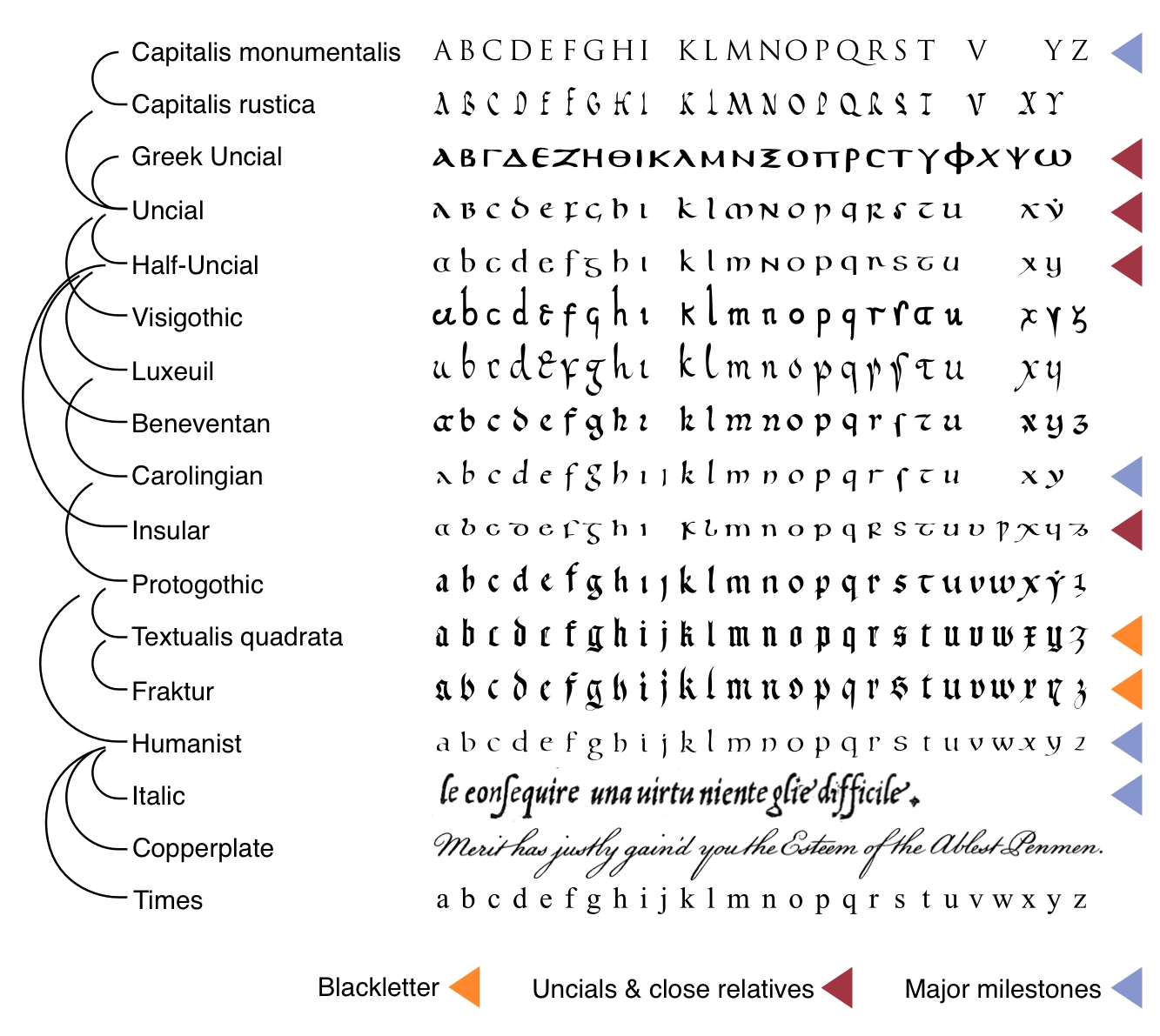
Calligraphy has taken many forms over the centuries, visible in various of Bo’s fonts. The story of European calligraphy describes, in broad strokes, the evolution of today’s Latin alphabet. After the classical Roman capitals of antiquity, you get 9th-century Carolingian miniscule from the first Holy Roman Emperor and 15th-century italics (or chancery cursive, cancellaresca) from Renaissance Italy. Major branches along the way, now special because they fell out of ubiquity, are the early medieval uncials and late medieval blackletter (which remained normal in Germany and much of Scandinavia until the last century).
The rise of printing launched a spiraling interplay between calligraphy and type, which imitated calligraphy wholeheartedly for about three centuries before breaking away from the dictates of hand and pen. Bo Berndal and Karl-Erik Forsberg were descendants of a great calligraphic revival stemming from the end of the 19th century. It appears that England and Germany led the way, with several transplants from both countries spreading the movement to the United States.
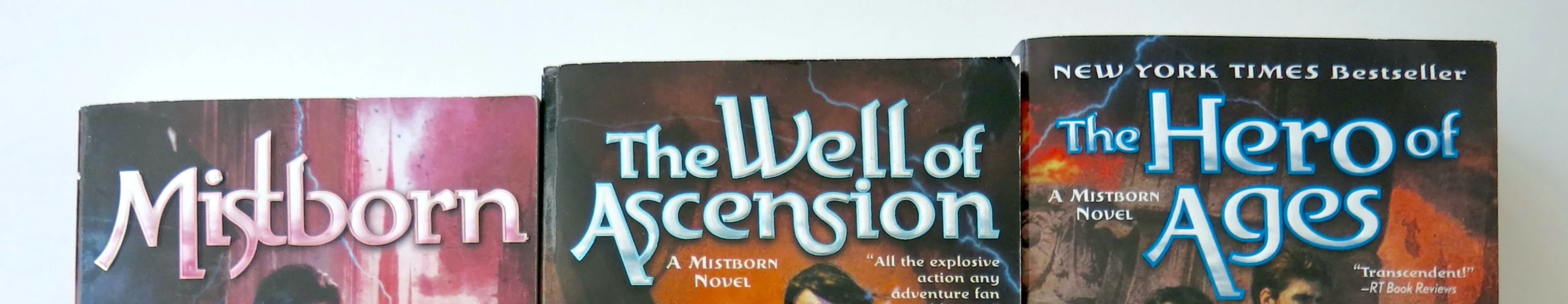
Search “calligraphy” nowadays on Google or in a library catalog, and what you’ll find is a flood of tutorials promising easy, fun, and stylish. These popular cursives have bloomed everywhere: wedding invites, restaurant signage, Instagram posts. Naturally they are sneered upon by the True Practitioners of Calligraphy as Handed Down By the Ancient Fathers. Imagine an epic fantasy cover lettered with one of these!
If the practice of calligraphy were governed with maximal control, it would become like the Lord Ruler’s perfect empire: highly functional, immortal, and even beautiful. Had innovation been throttled at some earlier point in the timeline, we’d have no uncials, or italics, or all other successors that emerged from snarls in the threads of precedent. Yet of course, without some measure of consistency, all things written would be incomprehensible outside their specific time and place of origin. If you’ve puzzled over old documents, you know what it feels like to be illiterate in this way. Imagine if radical changes happened every generation.

With every stroke and serif, calligraphers and type designers skate a delicate balance between idiosyncrasy and uniformity.
The various calligraphic styles or hands, as they are known, are the different fonts of handwriting. Each hand comes with clear rules. This structure can of course give the calligrapher new powers of personal expression, although they were developed to subsume individual quirks into one particular ideal of beauty. Any particular aesthetic style can stifle creativity, or encourage it.
Consider a classic. Spencerian is a specific 19th-century variant of the copperplate or English roundhand style. These are each probably familiar to you—highly ornate, loops within curls within loops, appearing nowadays for only the most formal occasions. Spencerian actually pruned away some of the roundhand excess, and since its time many US Americans have been learning a still more simplified form of it as children in school. The most famous rendition of Spencerian lettering must be the Coca-Cola logo.

The eponymous Platt Rogers Spencer claimed that calligraphy rescued him from alcoholism. How? Discipline and, perhaps, the mere contemplation of graceful letters. Throughout his career, he preached the power of his script, inspired by forms in nature and combining efficiency with elegance. Spencerian became popular across the USA through a “network of schools and disciples, propagating the practice…through drills, routines, handwriting exercises of an almost military precision” (Hensher). Another lover of penmanship agrees the drills were “supremely tedious…designed to squeeze to death even the most forceful and artistic handwriting” (Florey).
Yet even Spencer did suggest unwavering imitation is not the destination but a phase of the journey. The 1866 Spencerian Key to Practical Penmanship includes a chapter on variety of style with the express intent to encourage individuality. We read the same from Edward Johnston, a leader of the next century’s calligraphic revival. In what became “the Bible of calligraphy” (Forsberg Vandring 33) and Bo’s “earliest inspiration” (Middendorp), Johnston asserts, “personal quality is essential to perfect workmanship, but that is the natural and gradual—sometimes scarcely visible—departure from a model, that comes of practice and time” (Johnston ch.XV).
These are admittedly small concessions to the role of personality in inking.
People get grandiose about lettermaking: “Forsberg, the artist of letters, cannot do violence to letters…he refines the shapes into an almost ideal consummation. Clean and unmalleable they emerge…in almost sacrosanct loftiness” (Forsberg Bokstaven). Slipping in “almost” here does not conceal the worship. Sure, Forsberg was a competent and even gifted person. But no need to make him a beaming angel! And letters. They matter, but any life or mystic power they may have is a metaphor, however meaningful.
Disciples of Mr. Spencer paid him compliments like, “the representations of his hand were as pure and chaste and beautiful as the peerless conceptions of his mind” (Spencer 9). I’ll grant you, 1866 was a different time and people often wrote in such effusions. But still.
Spencerian didn’t enjoy the same ubiquity in Sweden, where chancery cursive, aka italic script, dominated. At least, apart from its general broad impact on the world of calligraphy, Spencerian illustrates the zeal of tradition. There are, however, respected calligraphers who have earned prestige for testing the limits of the practice. Many of their experiments are gloriously illegible. These make stunning art pieces. Take for example Suzanne Moore, Susan Skarsgard, and Thomas Ingmire. Some of their work is reminiscent of street art, the well-known if more controversial manifestation of wild lettering. For all I’ve harped on Palekin’s weirdness, it’s obviously tame by comparison.
Whether calligraphers or not, career type designers make deliberate use of their influences. This arena I do know firsthand—after a few years of study and working with typography, I started making my own typefaces. Today, The Elements of Typographic Style by Robert Bringhurst is a renowned handbook in the world of type. His book enshrines likeminded views about the dignity, timelessness, intelligence, and grace of well-crafted type (i.e., type with reverence for convention).
I’m both cheeky and serious here. I love Bringhurst’s book and consult it more than most others I own. Nor do I dispute the need for care and thoughtfulness in good type design, and good design with type. Even when a particular composition is slung together at random, or by intuition alone, there is often a wealth of thought or experience that precedes that moment in the designer’s life. Creativity thrives on constraints. Formality tends to give valuable structure to art. I’m glad Bo deployed his training to design the unconventional. However, all this background in calligraphy continues to frame the enigma of Palekin without touching it. The hands favored in midcentury Sweden, such as italic, offer no more clarification than Spencerian.
Palekin’s defining attributes
Let’s examine the flouted conventions, comparing with Bo’s other fonts. Three major points define Palekin’s distinctive quality:
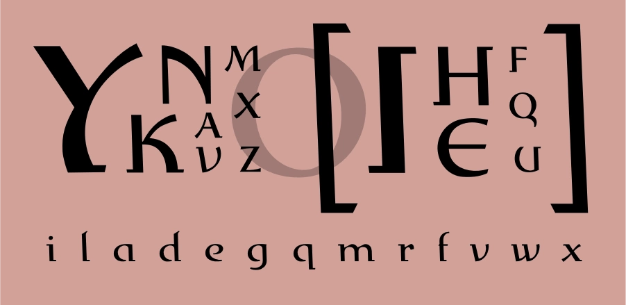
First, nearly all the caps inherit their structure from the O. This is unusual. Designers tend to start with both O (pure curves) and H (all straights), and then extrapolate the uppercase alphabet. Just over half the roman alphabet in uppercase (AEFHIKLMNTVWXYZ) is typically composed of all straight strokes. Diagonals are a special subset of straight strokes. In Palekin, most of the diagonals are hybrid, curves spliced with straights. Only Z escapes the diagonals’ dominant trend, maybe to keep it distinct from 2. Simple verticals and horizontals remain unbent (FHILT). I won’t enumerate all the exceptions, but you see the same pattern in lowercase.
This roundness echoes the visual logic of Isaac Stewart’s symbols for Allomancy, based on bent nails. The large-bowl shapes are common in all uncial varieties (see the above graphic), which will be familiar to fantasy readers.
Maybe the most outlandish character is that uppercase Y. Have you ever seen anything like it? That long right concave stroke contradicts all expectations. The nearest comparisons I know is when italics feature concave y—usually lowercase, and often with more gentle curvature—or the occasional whale-tail Y with curled upper strokes (reminiscent of Greek upsilon, for example in Pocketype). But neither of those precedents prepared the world for this wild Y. It’s brash, rebellious, a naysayer and a heretic. I wouldn’t call it my favorite character in the font, or the most beautiful or functional, but the Y demonstrates how weird and playful this font can get. Yet for all that, it clearly follows the logic of the style.
Second, the vertical strokes slant leftward. Another peculiarity, this one most obvious in the square brackets []. It is also emphasized by the half-serifs on H and I. As you know, italics slant to the right. Leaning the other direction is rare, edgy, conspicuous. It pulls against the rightward flow of Latin-based text.
A scant few of Bo’s fonts tilt left, notably Maricava [1994], which is someone’s digitized handwriting, and Vadstenakursiv [1989], a revival of script from Swedish history.
Third, he sliced off the serifs—but only half of them. The asymmetry is striking. Compare with a typical serif typeface like Times New Roman. Or simply look again at the H and I, which dangle their semi-serifs proudly. The backslant keeps them in balance, and maybe that’s the main reason for it. The 90s brought all sorts of similar postmodern experimentation, flouting and recombining the styles of history. Dead History is a classic example, and its name speaks for the grunge trends of the time. Other mishmash fonts like Amplifier and Entropy followed. The flock of them must have helped inspire Palekin.
As I can figure, Exlibris [1992] is where Bo tried dropping serifs first, and then he repeated the trick a few more times in his career (Freipress/Presstek [1997], Golota [1997], and Mixtra [2006]). You see him playing with certain quirks again and again. Exlibris is Palekin’s restrained older sibling, with subtle curves in the diagonals, more traditional uppercase, and bdgpq bowls slightly ajar.
A few other minor observations: Palekin’s contrast is moderate. The pen nib—thinking in calligraphic terms—doesn’t quite seem to keep a constant angle as is conventional (though I haven’t learned to see that with confidence). Enclosing strokes almost never touch (see BDPRabdegpq), or in other words the bowls and loops are cracked open, which gives the font a stencil appearance.
For all its peculiarity, Palekin is well-crafted. The rhythm of light and dark and the shaping of negative space is smart and lively. The letterforms feel like frames for stained glass. They catch and twirl the light. Not in the fluid way of swashes and calligraphy—too many hard edges—but these strong bowed lines generate movement from tension. Light seems to make them swell and burst. Even in black and white, color radiates from them. Color feels so natural to these forms that it almost lives in them as a ghost image.
Theories of origin
This far, my research yielded no direct links to Palekin. Given the importance of ancestry in type design, I had to believe Bo had gotten inspiration somewhere. Many of Bo’s fonts have a clear stylistic genealogy: Benedikt, Johabu, Vadstenakursiv, Nordik, Logoform.
With a loose overall resemblance to Palekin, Vadstenakursiv is unambiguously grounded in history. It’s derived from what Bo describes as one of the classic examples of Swedish type (Frigyes Typiskt 169). Vadstena is a town associated with Heliga Birgitta (Saint Bridget of Sweden), the 14th-century visionary, mystic, and founder of a monastic order beginning at Vadstena. Bo made another typeface named just for Birgitta. Outspoken and influential, she advised at the Swedish royal court and immigrated to Rome during the height of the Black Death, where she lived an ascetic but politically active life. Her revelations involved personal encounters with God and the Virgin and “extremely tangible imagery” (Lindkvist SKBL) of Purgatory, the crucifixion and the nativity. Her descriptions changed Christian iconography across Europe.
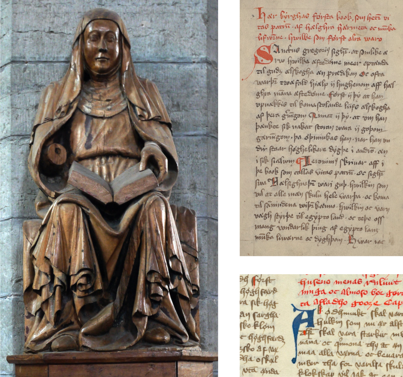
A variant of medieval blackletter, Vadstena cursive was used for local inscriptions and documents like the provincial law code—written down after Christianization, from oral memory, for the semi-autonomous province enclosing Vadstena. Bo seems to have both modernized and harmonized the caps with the lowercase, but his caps still echo the shapes of medieval initials like Lombardic capitals. He apparently took cues from Vadstena-sourced lettering by Charles Sandahl in a 1928 calligraphy manual (Frigyes Typiskt 172), which may be why the font is rather distinct from manuscript samples I can find. To see the font, look in Klingspor’s catalog of Bo’s work. You’ll find it’s somewhat closer to Palekin than the handwriting samples above.
I can imagine Vadstenakursiv, or blackletters generally, being a background influence to Palekin. But after investigating these avenues I’ve presented and others I haven’t, my best candidates for ancestors were the following.
One is Greek, with its lowercase preponderance of loops and curves. I’ve seen no evidence that Bo was interested in Greek per se. But—
Another is uncials, a somewhat broad category that includes Greek and Latin scripts, and may be most familiar in forms like Tolkien’s lettering style for Middle Earth maps and illustrations. Its close cousins are Insular script, Gaelic script, half uncials, and Irish uncials (these terms often get used interchangeably, much to the horror of all paleographers I’m sure). You’ve seen how round the uncials are from the “Evolution of miniscule” chart above.
A calligrapher like Bo would know at least a couple variants of uncial. He did make at least one into a typeface: Benedikt [1991]. Klingspor shows this was likely re-released in 1998 as Bo Uncial, which would make it one of a select few fonts that he named after himself. I would count uncials as a significant influence on Palekin, but it lacks some of the more distinctive uncial forms like A, D, M, and T.
Third is runes. These, while intriguing and linked to Bo’s cherished heritage, were easy to dismiss because they tend to be engraved monoline, without curvature. Then I had a surprising encounter. It happens that runes too have seen many iterations over the centuries, and this brings us to part three in this trilogy of articles.

Photo by Nemracc, CC BY-SA 4.0, via Wikimedia Commons
______
SOURCES
(Note: where necessary I translated Swedish quotes into English.)
• “Bo Berndal.” International Type Designer Archive, Klingspor Museum.
• Hensher, Philip. The Missing Ink. Farrar, Straus and Giroux, 2012.
• Florey, Kitty Burns. Script and Scribble: The Rise and Fall of Handwriting. Melville House, 2009.
• Forsberg, Karl-Erik. Vandring bland bokstavsformer. Norstedt, 1992.
• Forsberg, Karl-Erik, and Sten G. Lindberg. Bokstaven och ordet. Wiken, 1990.
• Frigyes, Paul. Svensk skönskrift. T. Fischer & Co., 1993.
• Frigyes, Paul, and Bo Berndal. Typiskt typografiskt. T. Fischer & Co, 1990.
• Johnston, Edward. Writing & Illuminating & Lettering. J. Hogg, 1917.
• Lindkvist, Thomas. “Birgitta Birgersdotter (Heliga Birgitta).” SKBL: Svenskt kvinnobiografiskt lexikon.
• Middendorp, Jan, editor. “Creative Characters: Bo Berndal.” MyFonts newsletter, August 2011.
• Spencer, H. C. and Platt R. Spencer. Spencerian Key to Practical Penmanship. Ivison, Phinney, Blakeman & Co., 1866.
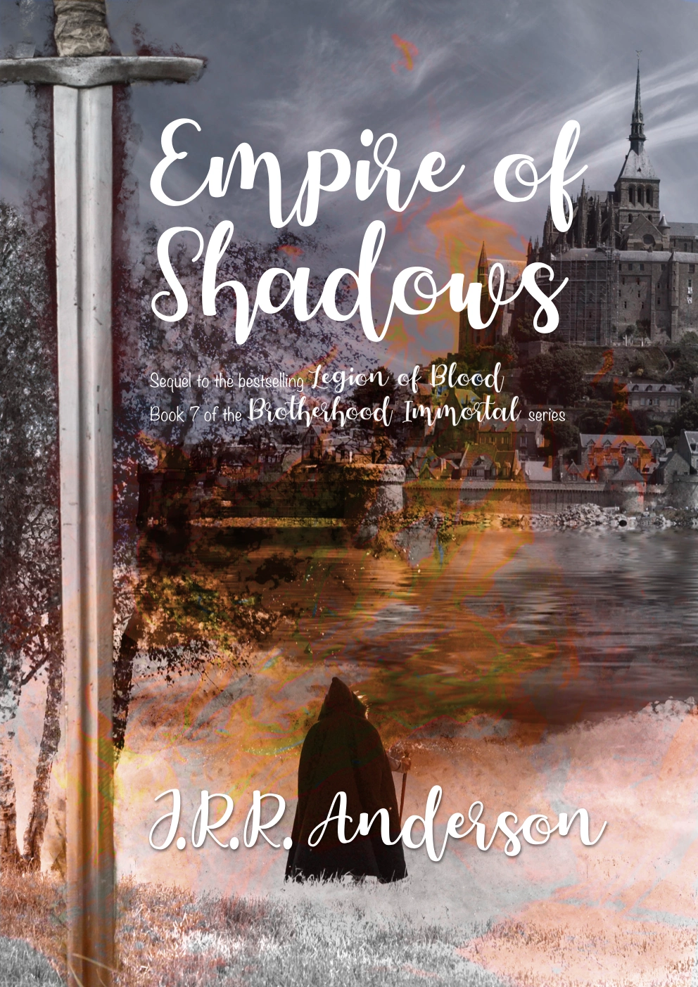
I for one can’t wait to read Empire of Shadows. I hope there’s a love triangle!