Where did these letterforms come from? Who made them, and why?
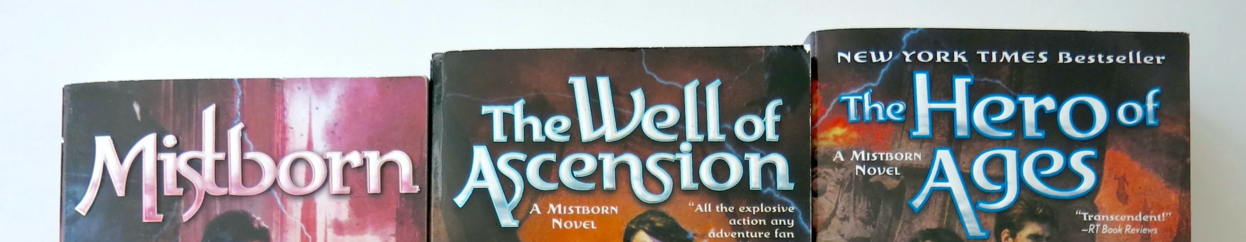
Two Three At least five title fonts have been used for the US editions of this fantasy series by Brandon Sanderson. Of those fonts, the most iconic and longest-reigning is unquestionably the one above. I wanted to learn its story if possible, so for months I’ve sifted through practically all I can find online or in print.
And what a story has unfurled. Let me tell you in the plainest words I can devise. A traveler describes a land of mist where planets incarnate raise mortals to gods. The traveler’s book is emblazoned with a curious alphabet, originally inscribed in a pillar of sand by a certain calligrapher, in imitation of a lion who preached a mythic land where incarnate planets raise mortals to gods.
I will explain. Eventually.
This is not an essay about Mistborn per se, although it sprouted from my little study of the book’s cover. No, this is a tale spanning centuries and disciplines, from the digital to the mystical. It binds together a rare assortment of elements into surprising harmony.
Such a story often goes untold. Except for a few bright stars, type designers rarely get attention from society at large. Far less any one of their fonts. There are big-name exceptions: Helvetica, Times New Roman, Futura, Garamond. People write whole books about these celebrities. The lesser characters slip into obscurity.
I wonder how many sales this particular font has earned in its life. I wonder how many came from Mistborn. My scattershot searches didn’t turn up any discussions about the topic. It’s not an item of discussion. And to be sure, although I’ve admired the cover lettering for years, I don’t believe I tried to dig up the font until last year when I decided to embark on a valiant quest of research.
It wasn’t hard to find. Not really. Just hard enough to deflect my first flimsy effort some years back, before I’d collected the determination and a bit of typographic knowledge to guide me. As it happened, the key was meeting a certain old sage, born year 11 of the World Wide Web. After testing my resolve with a series of cryptic questions, Identifont dropped a gift of pure insight into my tremulous, outstretched eyeballs.
(Here you are Google, if your bots ever deign to touch this desolate corner of the internet:)
The iconic Mistborn title font is Palekin, designed by Bo Berndal in 1994.
Calligraphy in sand
Meet the typesmith.
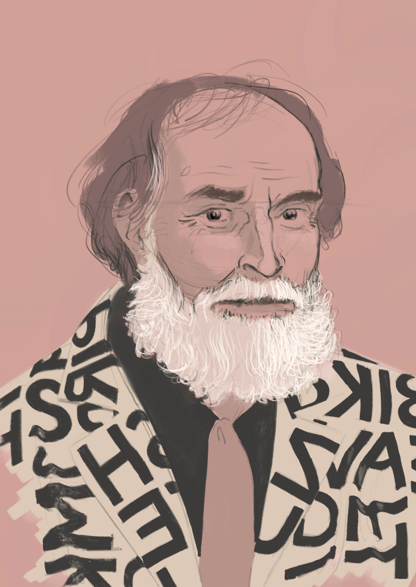
This here’s a decent likeness of Bo Berndal, but see MyFonts and Klingspor for actual photos. Also take a look at Bo’s profile page from Linotype circa 2006. It’s a unique and delightful glimpse of how he chose to presented himself at the end of his career.
Career
When young Bo picked up Tarzan of the Apes for the first time, he was startled to realize he must have read it before. More than deja vu: what he found familiar wasn’t the content but the typeface—Genzsch-Antiqua— used to print that edition, like a great many books in Sweden during the early/middle 20th century. Since that time he couldn’t read a book without knowing what typeface it was printed in (Middendorp interview). This gives you some sense of Bo’s lifelong devotion to letterforms.
Bo’s career in type and lettering spanned over half a century. He left school at 13 to work at a used car shop, whereupon WWII disrupted the auto industry, and thus Bo switched tracks into printing. He wasn’t content with setting type, whether by hand or Linotype machine.* Back to school then—this time, a trade school specializing in bokhantverk or bokkonst, the craft of printing, what today would be called graphic design. Calligraphy was central. For two decades thereafter Bo was occupied designing handlettered book covers, a practice in vogue in Sweden at the time. He also began designing fonts.
*huge steampunk typewriter that dominated the printing industry for most of the 20th century
Many of Bo’s fonts, including Palekin, manifest his background in calligraphy. He considered the pen and the machine interdependent domains: “My calligraphy has always been intended for printing” (Frigyes Skönskrift 124). During the first half of Bo’s career, a font was drawn scrupulously by hand on paper. This original was then faithfully translated into molds for metal pieces of type. Bo adopted the Macintosh early as an alternative type design tool and remained loyal to it. In his positive outlook, “Computers have opened to us the world before the Renaissance. Suddenly it’s become possible to write mechanically with hand scripts that haven’t been available since before the birth of printing” (Frigyes Skönskrift 125).

Captioned by Bo: “Small Macs, which other manufacturers ironically call birdhouses, have been a hit thanks to their user-friendliness and good software. Every desktop computer should be furnished with a pencil, so that the designer can sketch a rough draft before the joyful experimentation or difficult composition begins on the screen.”
He’d get lyrical about his beloved machine: “I am in heaven when working on the computer, drawing pictures of sound” (Middendorp interview). In a late stage of his career, he admitted pen and brush were important but peripheral tools; he’d ink letters most often for the purpose of digitizing (Frigyes Skönskrift 125). Bo loved his work too much to give it up in retirement.
Process
Klingspor Museum in Germany has the most comprehensive catalog of Bo’s fonts I can find, although I know it’s missing a handful or more. The Klingspor catalog records an average release of 5.7 typefaces per year across the 1990s. The decade’s first half was more uneven. Palekin premiered 1994. From 1995 onward he had a more consistent pace. Six fonts a year over a fifty-year career puts him at 300 total.
In 1998, some years after converting to a digital workflow, Bo said it would take him just over a week to produce any given style (regular, italic, bold, etc) of a typeface (Anderson interview). Bo’s fonts tend to include about 250 characters—including accented letters, punctuation, and symbols—a standard set that covers the majority of European languages. He learned to prefer the freshness of the first iteration instead of refining letterforms to death. With historical typefaces, he’d draw each character for itself. Otherwise he’d often use a more modular system, as is common in type design.
Despite that short creative burst, a good font requires ample testing and fine-tuning. A typeface with its bold and italic styles might really take Bo two years from initiation to release, not counting the groundwork laid over decades of refining the concept in earlier fonts. This is how Bo described the making of Fripress/Freipress/Presstec (he changed the name a couple times), which was a collaboration led by Bo. Fripress, like Palekin, is notable for its amputated serifs.
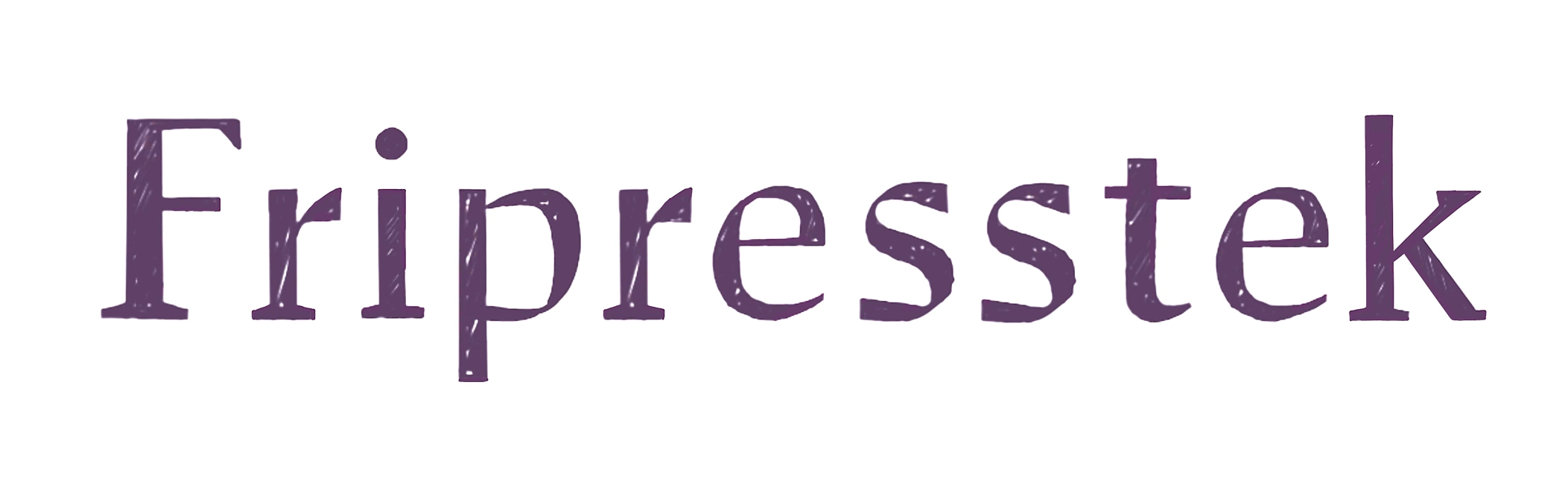
(Why a drawing? Because I couldn’t find this font except through images and I don’t have rights to them. But this is a pretty faithful recreation based on what’s available from Nebulosa and Pelle Anderson’s 1998 interview.)
Personality
A fellow designer, Örjan Nordling, remembered Bo as a friendly, easygoing, and indefatigable participant in the local type community. Bo often wore a particular blazer adorned with typography, which is so awesome I’ve taken care to include it in his portrait above.
The fonts Bo produced are a record of his tastes and interests, his social network, his cultural heritage and historical knowledge. He made Jerrywi as a tribute to rock singer Jerry Williams. Bo digitized his handwriting as Boscribe, a fluid and economical script. Informal letters from Bo (handwritten or typed in Boscribe) were brief and witty. In one Bo described his satisfaction after convincing Monotype in England to keep the umlauts on the name of his font Läckö, named for a castle on Sweden’s largest lake, even though those dots might spook English speakers. In Bo’s wry words, “Victory over the Empire.”

In his yearly Christmas cards he included fonts, facts, anecdotes, and illustrations like this cartoon (Frigyes Typiskt endmatter). It shows two men putting up business signage on a wall. Seeing a mistake, Bo comes to explain why the thick stroke on the letter A belongs on the right side. The men ignore his advice and send him packing. I’m not sure if Bo himself drew it, but regardless it’s a nice vignette of his character.

If Bo Berndal were a Mistborn character, he might be Noorden, the ex-obligator who becomes a secretary to Elend, or perhaps he’d be Slowswift, the noble informant Vin contacts during the siege of Yomen’s city. Both are curious, seasoned, forthright and orderly fellows. They aren’t central but they are important. They’re skilled at what they do, honoring the past while adroitly adapting to change.
Attitudes
Bo’s book Typiskt typografiskt, published 1990, reveals a respect for tradition as well as alacrity for changing times. Coauthor Paul Frigyes describes Bo’s work as joyful, committed, robust, and inventive (Typiskt 10). When discussing type, Bo prefers to emphasize the traditional Renaissance craftsmanship that is a mainstay for type designers working with Latin script. Intelligence, clarity, and tranquility are the qualities he most often attributes to good type.
I find Bo repeatedly speaking of quietness and liveliness. He seems to admire this paradoxical pair above all other traits. For example, Berling Antikva is “one of my absolute favorite typefaces because it has life without being dramatic” (Typiskt 181). Berling was made by Karl-Erik Forsberg, “father of the Swedish letterform” (Typiskt 181) and likely the most prominent Swedish type designer/calligrapher in the 20th century.
Bo was quick to defend the typographic heritage of his homeland, a country not much acclaimed for its role in type history. Near the conclusion of his book, Bo waxes poetic about the lightness of the best Nordic type (Typiskt 184). The long bright summers of the North, he believes, have infused light into the creative works from Scandinavia. Many commentators on Nordic design make similar claims (see for example Scandinavian Design Beyond the Myth). The wild climate, seasons, and natural domain—above all that golden summer glow—stir the souls of them yonder Viking-folk to craft bright and beautiful things. Truth or myth? Probably both.
What I find ironic is the great Forsberg also admired this same light, delicate style—clearly! it’s a constant presence in his life’s work—and yet he considered it radically foreign. Imported from Italy, the humanist antiqua style “hardly expresses anything of the Nordic spirit” and also “stands in opposition to the hardness in our consonant-rich [Swedish] language” (Forsberg 207–208). The irony doesn’t end there. Forsberg made that argument in the heyday of Renaissance-revival type in Sweden, while Berndal made his contrary claim in a postmodern world that refuted the authority of tradition. But perhaps it’s only logical.
Mind, Berndal had no objection to adopting foreign influences. Quite the reverse. He felt that recombining outside stimuli with sober calligraphy in airy compositions was in fact the essence of good Swedish typography. He endorsed the saying “Keep Sweden Mixed” (Frigyes Typiskt 184).
An orphan alphabet
Palekin does not fit Bo’s typical criteria for great fonts. It’s not quiet. It’s not a clear descendant of the humanist or italic families. It’s not a clear descendant of any family.
On sites like Identifont or WhatTheFont, every search “by Appearance” turns up multiple fonts, all of which should be similar to the target. None were close to Palekin.
With the font name in hand, I have gone back and searched “Palekin” directly, which gives me different results for “Similar fonts,” but still no strong resemblance. (Compare with two popular searches on Identifont—Catull and Optima—or even something as weird as Dead History.) The whole combination of curves, semi-serifs, and historical dissonance sets Palekin apart from its supposed relatives by a wide margin. Why so different? How did this peculiar child come into the world? Tune in for the next two installments of Mistborn type history to find out.
PART TWO • PART THREE
______
SOURCES
(Note: where necessary I translated Swedish quotes into English.)
• Anderson, Pelle interviewing Bo Berndal. “Bo Berndal tappar serifferna.” 1998.
• “Bo Berndal.” International Type Designer Archive, Klingspor Museum.
• Halén, Widar, and Kerstin Wickman, editors. Scandinavian Design Beyond the Myth: Fifty Years of Design from the Nordic Countries. Arvinius+Orfeus, 2004.
• Forsberg, Karl-Erik. Vandring bland bokstavsformer. Norstedt, 1992.
• Frigyes, Paul. Svensk skönskrift. T. Fischer & Co., 1993.
• Frigyes, Paul, and Bo Berndal. Typiskt typografiskt. T. Fischer & Co, 1990.
• Middendorp, Jan, editor. “Creative Characters: Bo Berndal.” MyFonts newsletter, August 2011.
• Nordling, Örjan. “Några minnen av Bo Berndal.” Stockholms Typografiska Gille blog, 2013.
• Törngren, Lasse. “Bo, tuben och typerna.” Nebulosa blog, 2001.